Update, 10/30:
To see the finished wireframe, featuring my designs as well as those from the rest of my team, click here.
Original post:
As part of a Sprint team, I am working on improving Apple’s abandoned and unloved child, the Podcasts app. We’re in the prototyping phase of the sprint right now, which essentially means we are creating simulations of a new app that works the way we want it to.
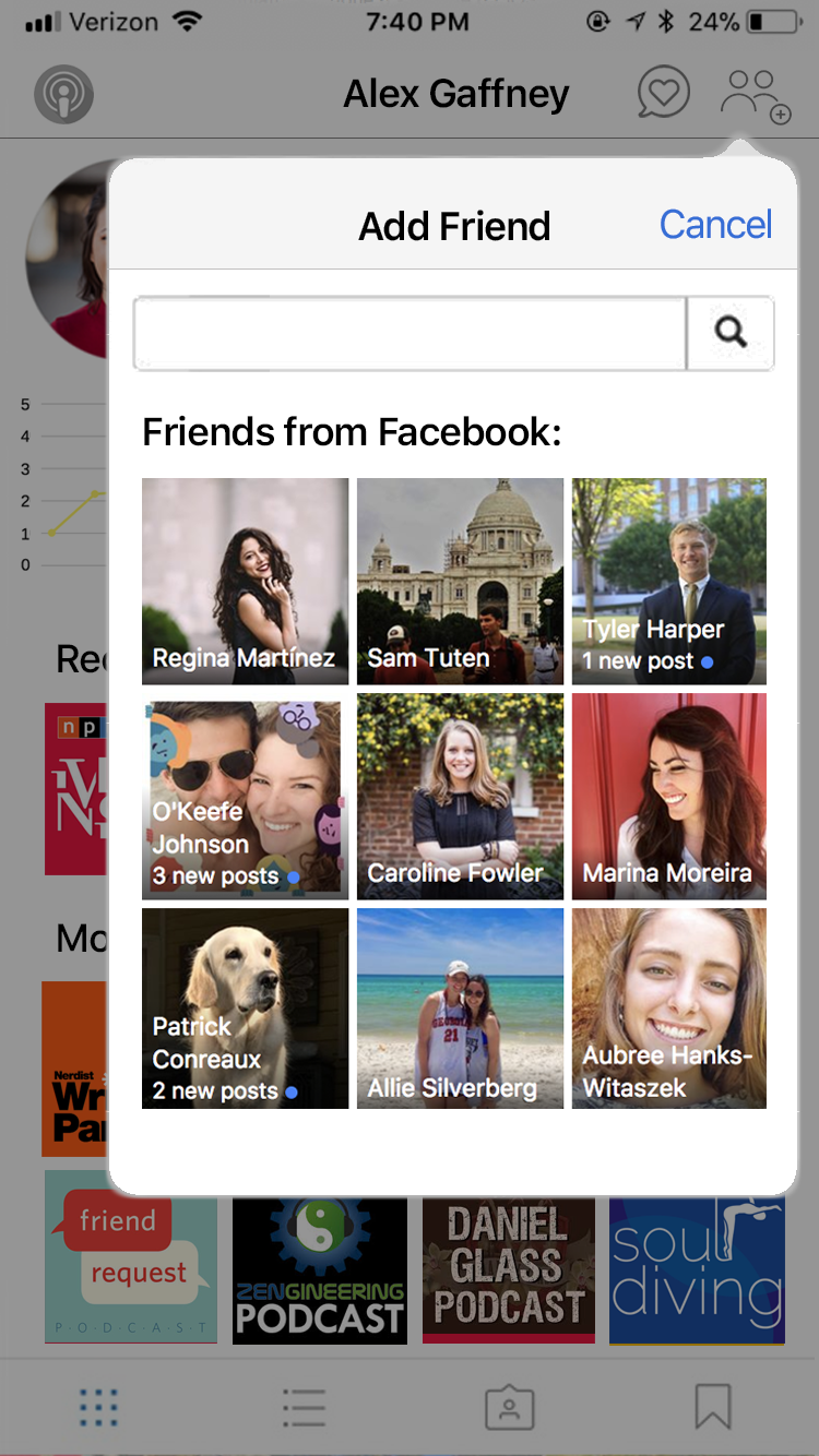
One of the improvements that we are making involves adding profiles for podcast listeners. I mocked up a few of the profile’s would-be capabilities, which include:
- A heat graph that shows the amount of time you’ve spent listening to podcasts over the past few weeks
- A profile photo and bio
- Featured playlists the listener has created or subscribed to
- Adding friends via Facebook.
There are so many more capabilities and features that I would like to explore, but scope creep is real, and these few took many more hours than I had expected.
MATERIALS
A borrowed edition of San Francisco
Photoshop (really should have used InDesign)
Canva, to make the line graph
Design elements borrowed haphazardly from Facebook, Apple, Instagram, Spotify, and lots of podcasts.
Marvel, a free online prototyping software. I’d rather use Sketch, but the new Emerging Media Masters design lab is still in the process of licensing it.
THOUGHTS
This is my first formal UI mockup since 2015—cannot believe it’s been two years. During this process, I gained even more respect for UX/UI designers, who spend more time sweating the details than most of us can imagine. At first, a prototype sounds like something that can be thrown together lackadaisically and fixed later. But the reality is, if you want a good test, your prototype has to feel like the real deal. And getting that feeling requires everything to be just right.
Over the past year, I’ve worked three internships at IMG LIVE, a magnificent experiential marketing agency. At IMG LIVE, the same principle held true. The experiences — events, 5Ks, pop-ups, and more—had to have everything just right so that you, the visitor, could have that magic moment and engage with your surroundings. It’s not about the font—or the color of the chairs, or the instruments in the band. But the sum of those parts makes it real for you, and that’s why everything matters.